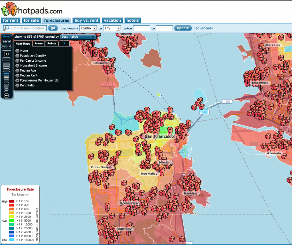
There’s been a fair bit of discussion on various real estate blogs about the state of foreclosures in San Francisco. Here’s a picture of SF, courtesy of Hotpads, on our little patch of heaven.
Core SF neighborhoods seem to be doing OK, though worse than “average” — not defined by Hotpads as best as I could tell. Outer neighborhoods are not doing so well.
The big surprise is the amount of red over in Marin, including toney areas like Sausalito and Mill Valley. Frankly, I’m skeptical; it just doesn’t add up. There’s not a lot of information on the free part of their website on their methodology though I believe they’re using data from Realtytrac, which has its own fee-based foreclosure radar website. If I come up with better information I’ll update this posting.


There is a better, faster loading foreclosure heat map for San Fran at http://www.localetrends.com/metro/san_francisco_california_home.php?MAP_TYPE=re_f