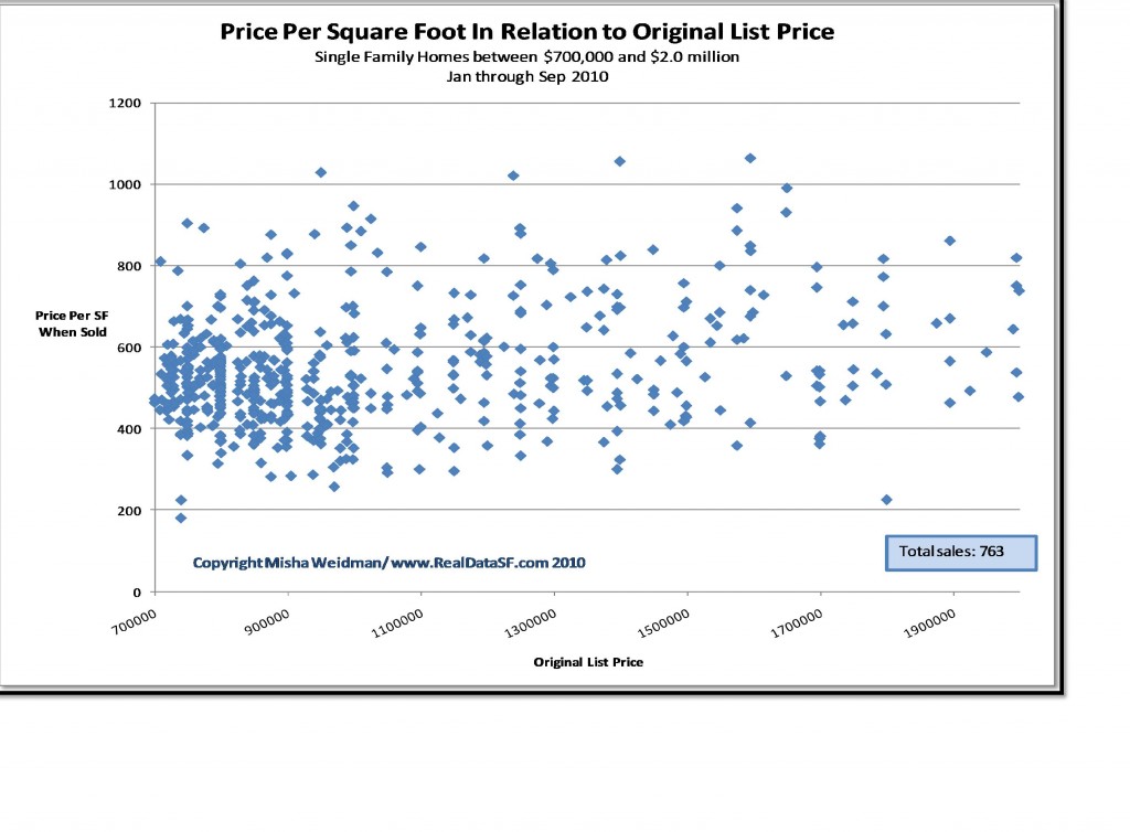
Say you want to spend around a million bucks to buy a house. Wouldn’t it be useful to know how much houses typically go for per square foot in that price range? Then you could take the square footage of the house you’re looking at, multiply it by the price per square foot and come up with a rough idea of value.
Now say you’re in the happy position of having $2 million dollars to spend. Could be that $2 million dollar houses cost that much just because they’re bigger than $1 million houses, in which case their price per square foot would be the same. Or they might cost more because of the area they’re in, or their finishes and amenities. Whatever the reason, it would be useful to know how much they go for on a per square foot basis.
We’ve discussed the relationship between selling price and price per square foot previously in the context of which is a more useful barometer of the market. But I’d never thought of plotting the relationship between the two directly until a friend of mine suggested that I do so on a scatter chart.
To be honest, I’ve never liked scatter charts — those messy Roschach blots of the statistical world. To my untrained eye, they don’t tell a nice clean story.
Well, now I like them even less. Take a look at this one (click to enlarge).
Each point represents the sale of a single family home in 2010 through September. The point’s location on the X axis shows the original listing price and its height on the Y axis shows how much the property actually sold for on a per square foot basis. This chart includes only those sales with an original list price between $700,000 and $2,000,000, which covers the vast majority of single family home sales in San Francisco. In fact, as the dense cluster of dots at the left end of the chart shows, most sales are in the $700,000 to $1 million range.
Here’s why I hate this chart.
It proves that there’s no relationship between a property’s listing price and how much it will sell for on a per square foot basis.
You can be looking at a nice home in the Excelsior with an original list price of $750,000 and it could sell for 400 bucks a foot or double that. Head out to Noe Valley and spend $1.5 million and the spread on a per square foot basis will be just the same. (There are just a whole lot less sales at that price point.) And since this chart shows the relationship (or lack thereof) between list price and price per square foot, the inevitable corollary is:
There’s no relationship between the size of a house and its price per square foot.
If there were, you’d expect the range of prices per square foot to be narrow. But it’s not. It’s wide. If a $1.2 million house can sell for $400 a foot or double that, it means it could be 3,000 square feet or half that size. Put another way, if I ran the scatter chart with square footage on the Y-axis instead of price per square foot, the dots would line up just the same.
Hence the salacious headline: The size of a home or the size of its list price won’t help you predict how much it “should” sell for on a per square foot basis.
In fact, this suggests that what real estate agents have been saying ever since they first sold a cave to Cro-Magnon is actually true: Homes are unique. Their value depends on a multitude of specific variables that include location, finishes, amenities, light, “curb appeal,” and the competition down the street. The only way to size up what a house is “worth” is to take all of these factors into account.
Now if only I could come up with a chart for that.


Very interesting chart and analysis. It would be interesting to see whether this same lack of information existed in earlier years. I’d also be interested in seeing the chart over say the last 4-5 years but color coded by Board of Supervisors district (broader than zip code) to see if in fact neighborhood is the dominant factor. Or just do 10 separate charts by Supervisor district!!
Not sure what you mean by “lack of information.” As for supervisor districts, more useful I think to do it by MLS district. I began this analysis with subdistrict 5C which represents the core of Noe Valley. The scatter was all over the place, but with relatively few transactions. I’ll post that as well.
Finally a chart that speaks to me. I guess your next step will be a multiple regression to see what combination of factors would influence the price per square foot. Maybe if you control for original offer price first you may get a different response. Exclude foreclosure sales, take out overheated RE market bubble impact blah blah…. And banks still find a way to ask and loan on the basis of an appraisal. Puzzling. I guess the only conclusion is… The purchase of a house is not rational decision
Misha –
Really stellar, thanks! I’m particularly surprised there aren’t large effects around loan-limits.
The next question I’m curious about: could we do the same plot for an earlier year and color them based on appreciation?
Where can I get the data, I’d like to take a crack at it myself.
thanks!
-mike
Thanks Mike. I’ve actually been thinking about overlaying previous years to confirm that there has been a shift in the “mix” — one of the main complaints that people have against the use of medians as a metric. Can you explain what you mean by “color them based on appreciation?”