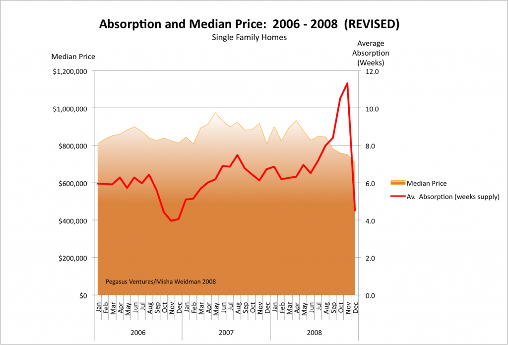
Thanks, Jean-Claude for making me take a second look at my methodology on my Absorption Chart. I had anticipated your point about the lag between listing dates and sales but had unfortunately gotten the formula backwards in my chart — basically dividing inventory by lagging sales, rather than forward sales: moral of the story: don’t do this stuff at 1 in the morning.) So I redid the chart with the correct formula inserted. (Excel groupies its =4*(AVERAGE(listings month 1, 2, 3)/AVERAGE(sales months 2, 3, and 4)). The data points at the end of the chart are averaged over shorter periods due to the lack of forward data.
One can quibble about whether a 30 day lag on listings to sales is sufficient, but the average days on market for 2006, 2007, and 2008 were 29, 41, and 51 respectively.
Here’s the revised chart. The median price line and the Absorption Rates line up beautifully, don’t they? Until you remember that there’s supposed to be an inverse correlation between them. True, there appears to be an inverse correlation over the last few months of 2008, but that could simply be due to the lack of forward data. It certainly doesn’t negate the lack of correlation over the previous nearly 3-year period.
Stay tuned for a chart showing median price plotted against Days on Market


Pingback: DOM Roll Please | Misha's Musings